
Basics
Themes in Chapper are based on XAML files which are located in your personal AppData folder (e. g. “c:\Users\USERNAME\AppData\Roaming\liGhun\Chapper\themes”.
Chapper reads the contents of this directory on every startup and add all *.xaml files to the themes listbox automatically.
Next to the XAML there may be an option .info file (which is a simple XML file) containing some additional informations like author name, homepage and so on.
My first theme – changing the colors
As a first starting point you should copy one of the existing themes to have the structure right away. Let’s start by copying the “Monokai.xaml” to “My First Theme.xaml” and the “Monokai.info” to “My First Theme.info”. Note: the embedded themes will be overwritten on every new installation / update so only work with your own copies.
So your “My First Theme.xaml” now looks something like this (details may change over the time):
<ResourceDictionary xmlns="http://schemas.microsoft.com/winfx/2006/xaml/presentation"
 xmlns:x="http://schemas.microsoft.com/winfx/2006/xaml">

 <!-- Colors -->

 <SolidColorBrush Color="#F8F8F0" x:Key="color_text" />
 <SolidColorBrush Color="#75715E" x:Key="color_header" />
 <SolidColorBrush Color="#75715E" x:Key="color_footer" />
 <SolidColorBrush Color="#66D9EF" x:Key="color_link" />
 <SolidColorBrush Color="#A6E22E" x:Key="color_username" />
 <SolidColorBrush Color="#F92672" x:Key="color_hashtag" />
 <SolidColorBrush Color="#272822" x:Key="color_main_background" />
 <SolidColorBrush Color="#F8F8F0" x:Key="color_main_foreground" />

<!-- more stuff - later on -->
</ResourceDictionary>
Let’s start with some quite extreme colors so we see the changes…
<ResourceDictionary xmlns="http://schemas.microsoft.com/winfx/2006/xaml/presentation"
 xmlns:x="http://schemas.microsoft.com/winfx/2006/xaml">

 <!-- Colors -->

 <SolidColorBrush Color="#FF0000" x:Key="color_text" />
 <SolidColorBrush Color="#AA0000" x:Key="color_header" />
 <SolidColorBrush Color="#00FF00" x:Key="color_footer" />
 <SolidColorBrush Color="#0000FF" x:Key="color_link" />
 <SolidColorBrush Color="#FFFF00" x:Key="color_username" />
 <SolidColorBrush Color="#00FFFF" x:Key="color_hashtag" />
 <SolidColorBrush Color="#FFAAFF" x:Key="color_main_background" />
 <SolidColorBrush Color="#000000" x:Key="color_main_foreground" />

<!-- more stuff - later on -->
</ResourceDictionary>
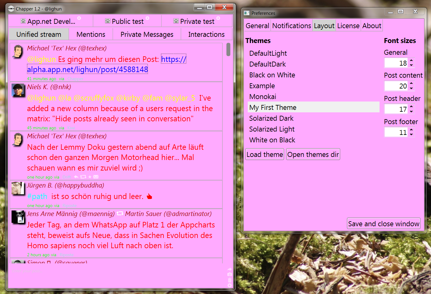
When you restart Chapper after the creation of the XAML file it will list your theme in the preferences already. Hint: When it is listed you do not need to restart Chapper when you change the XAML file during runtime – just press again the “Load theme” button to immediately see your changes in action.
So what will it look now? Well, this is what you get than:
The info file
We also created a “My First Theme.info” on start – in this file the following entries may be entered (all of them being optional):
<?xml version="1.0"?>
<ThemeInfo xmlns:xsd="http://www.w3.org/2001/XMLSchema" xmlns:xsi="http://www.w3.org/2001/XMLSchema-instance">
 <title>Example theme</title>
 <author>Sven Walther</author>
 <copyright>Sven Walther 2013</copyright>
 <version>1.0</version>
 <description>This example theme provides many examples on what can be done in own themes.
It might not be the nicest but might be a good start for your own advanced theme.</description>
 <homepage>http://www.nymphicusapp.com/chapper/</homepage>
 <useDefaultDarkItems>false</useDefaultDarkItems>
</ThemeInfo>
While the most entries should be self explaining some words about the key “useDefaultDarkItems”: When Chapper starts it loads a default style and by doing so the default icons which are the ones of the DefaultDark theme and those are white. If you create a light theme without providing icons (see below) set this value to “true” and Chapper will use the dark (black) buttons instead.
Using own icons
The icons used in Chapper can be exchanged by your own ones. To do so I added a shortcut in the XAML – whereever you insert the string “%THEMES_DIR%” into the XAML Chapper will exchange it with the full path to the themes folder. I suggest that you create an own subdirectory there called something like “My First Theme Icons” or similar. In the XAML the entries do look like the following example:
<ImageSource x:Key="button_repost">%THEMES_DIR%/Example_Images/repost.png</ImageSource>
<ImageSource x:Key="button_send_post">%THEMES_DIR%/Example_Images/send.png</ImageSource>
<ImageSource x:Key="button_add_image">%THEMES_DIR%/Example_Images/addImage.png</ImageSource>
<ImageSource x:Key="button_trash">%THEMES_DIR%/Example_Images/trash.png</ImageSource>
<ImageSource x:Key="button_preferences">%THEMES_DIR%/Example_Images/preferences.png</ImageSource>
The editor
As both the .xaml and the .info are XML files you may edit them with your favorite text editor (including Notepad) or your favorite XML editor. Most convenient will be the usage of Visual Studio Express (which is free but a very heavy installation on your harddrive).
Advanced possibilities
As Chapper loads a full XAML file and if you know more about Chapper you are able to completely redesign the whole interface. As shown in the “Example.xaml” this may include but is not limited to creating gradient brushes or boxes with rounded corners.
Chapper always loads a default XAML before it loads your XAML file – and this default XAML might be a very good starting point for you to see the default layouts and it can be downloaded here (I try to keep it up to date here).
Finally find the XAML of the MainWindow and the ItemBox (which displays the post content) for download here to see the structure (same here: I’ll try to keep them up to date).
Comments